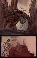
I tried a combination on this page of scanned pencil background art with the digital "drawing" in Photoshop which I don't really think works all that well. I think I like this effect - it seems a little warmer somehow. I might have to go back and try this treatment with the architecture and backgrounds on the other pages.


4 Comments:
Ok, I'm here to make up for my non-suggestion in an earlier post. Here are titles I thought of:
- Desolace
- Post Mortem
- Absolution
- The Wages of Sin
- Transgression
- In Consequence
Btw, the big monster dude kicks ass.
I'm indifferent. I think your stuff looks good either way. If I had to choose I'd go with your earlier style. But that's just because this one prolly isn't fully rendered yet. I'd say... go with whichever one is easier.
beautiful illustrations!!
Thanks guys!
Post a Comment
<< Home